
Small Update + Lettering Tip
Volume 2 has been done for a minute, and I’m so excited about it! If you haven’t, you can snag a copy on Amazon or if you run into me at one of the various conventions I’ll be attending (my show schedule is on the front page). I might slow down on doing shows for a bit as I try to wrap up this series. We just had our fourth child (I know, crazy, right?!) and I always feel guilty peacing out and letting my wife “herd the cattle” so to speak. Ha! It’s loud in our house, but it’s a lot of fun. Kids are awesome.
Anyway, I’m immediately moving forward with the third part. There’s a lot of work to be done for the last book, and as it’s the final one in the series, I want it to be as good as it can be! That said, I’d like to attend some shows since I always get to meet so many great people and artists there. I’d just also like to show up with more books and artwork done!
______
Below I wanted to share a little device I try using when lettering my comics. It doesn’t always work out (sometimes you just have too much text), but it’s served me well. I call it “snaking dialogue.” I doubt I’ve come up with this technique, but I don’t see many people talking about it. I started doing this because I was having my friends (who normally don’t read comics) try reading the stuff I was making. I realized that I could help them learn to read comics by intentionally leading their eyes through the flow of my word bubbles. It makes my comics read A LOT faster, because your eyes glide through a page naturally. There’s no resistence in where to read.
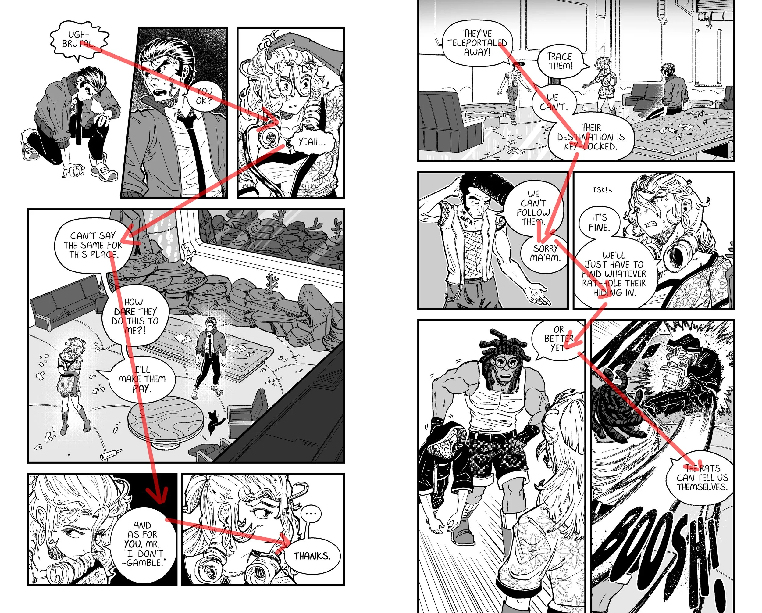
Just something to think about as you’re lettering your own comics!
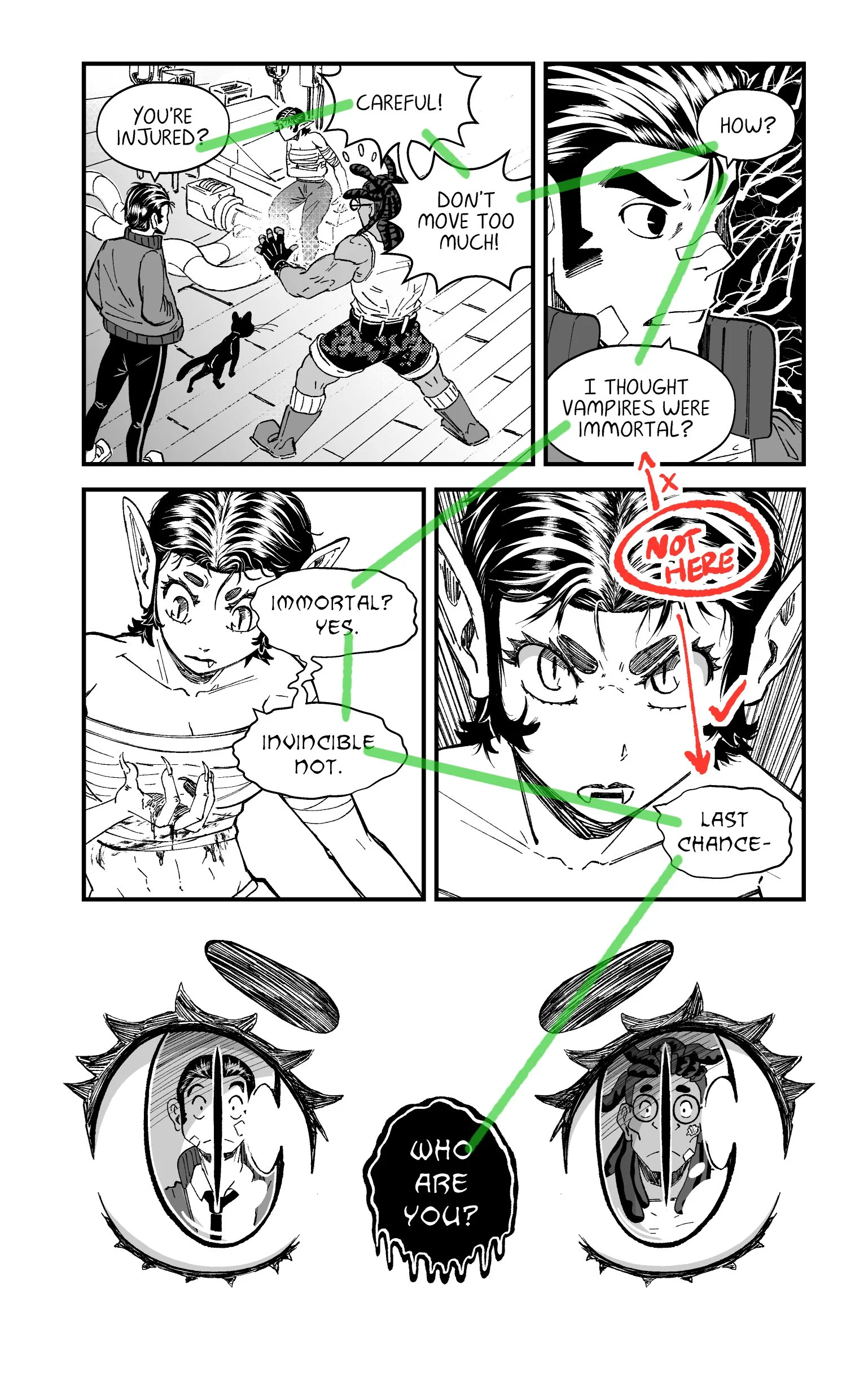
Like I said, this isn’t always practical, but it has helped me think about minimizing confusion especially on pages with a lot of dialogue. For example, I’ll try not to have bubbles too close together if they’re on panels that shouldn’t be consecutively read.
Does that make sense? I hope it does. Clarity of reading is important. I’d much rather have a clean panel layout that’s easy to read, than an artsy one that’s constantly confusing me. Might be why Akira is one of my favorites. Yes, the art is amazing, but it’s also very straight forward with it’s paneling.
Paneling. That’s a whole other subject. I digress!
I’ll admit, sometimes I take this obsession with making it “easy to read” way too far. Someone who reads lots of comics shouldn’t have any problem reading panel by panel.. You pick up the language of comics pretty fast. That said, I’d love for more people to start reading comics, so if this is the way I’ve been training myself to letter, and it doesn’t detract from what I’m trying to say, I don’t think I’ll stop anytime soon.
Good luck with your projects if you’re working on anything! I’ll get back to the third book.
Have a great day,
Adam